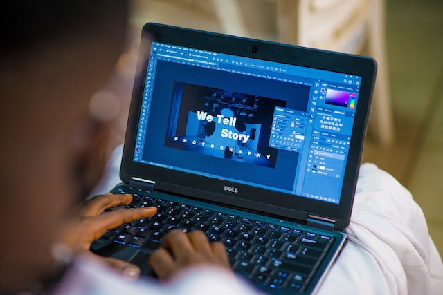
Graphic design is a high-level skill that involves creating digital designs using text, images, and other visual elements.
The basics of graphic design are unchanging. The main aim of any graphic designer is to produce designs that capture people’s attention and communicate specific messages to evoke emotions.

Image via Unsplash
Graphic Design Basics for Beginners
Whether you’re using a free banner design tool or you’re using paid editing software, you’ll need to learn basic techniques. There are certain design elements or principles that you can’t forget when you’re getting started as a graphic designer, and we’re going to discuss these below.
The basic elements of graphic design are:
- Color
- Image
- Line
- Shape
- Space
- Texture
- Type
Color
Colors have the incredible ability to evoke certain emotions in people. When you’re designing graphics, you can use color psychology to ensure that each of your designs conveys a specific message.
Alongside choosing the right color combinations, you also need to choose the right tones and shades. Lighter, pastel shades and tones are associated with calming, less dominant emotions. Darker shades or tones are more ominous and powerful.
Image
When adding images to your work, make sure they are consistent with the message that you want to convey. Choose images that make a strong impact on your views and draw their attention to your designs.
Line
Depending on the length, thickness, and combination of lines you choose, your designs can convey certain emotions. Heavier lines communicate formality and stability. Simple lines convey organization and scribbled lines promote excitement.
Shape
Shapes can be geometric or free-flowing. The former comprises a series of straight or curved lines that create shapes. They’re simple and often abstract.
The latter is more fun and creative. Free-flowing shapes can take on any form, and can be used to evoke a wide range of feelings and emotions in your audience.
Space
Space refers to the composition of your graphic designs. You can change the space between words and images to emphasize certain things and draw your viewer’s attention to specific parts of your designs.
You also need to consider white space, which refers to the areas of your designs that don’t contain any fonts or graphics. White space is important to create clear and visually impactful graphic designs.
Texture
Texture is one of the more complex components of graphic design. Generating texture in your designs creates character and depth. Texture is an important component of making your designs look professional and complete.
You can use textured typography or add texture to your images to enhance your designs. Even once your designs are complete, you can adjust the contrast, saturation, or transparency of certain elements in your graphic designs for added texture.
Type
Type is short for typography. The fonts that you use in your graphic design should be legible and cohesive with the other visual elements that you are using.
Aside from the copy itself, you also need to consider the size, thickness, and spacing of your typography. You can use more than one style of typography in a single design but stick to a maximum of three different fonts to avoid making your designs look cluttered and confusing.
